
TN Marketing Platform
Reimagined Streaming Platform with Personalization
Overview
TN Marketing is a global video streaming service that connects people through their passions. Our instructional content, focused on lifelong hobbies, reaches members in over 170 countries. With more than 10 million registered enthusiasts, TN Marketing continues to invest in both content and community.
At the core of our streaming experience is VidStore, TN Marketing’s award-winning platform. Built on industry-leading technology architectures, VidStore ensures reliability, scalability, and a seamless user experience for their members.
With an in-house production team managing hundreds of video shoots each year, contributing to a library of more than 7,700 hours of high-quality instructional content. Our diverse catalog spans hobbies such as crafting, fitness, personal defense, bowling, photography, cake decorating, and more.
My Role
AVP, UX & Design
Responsibilities
Creative/Product Strategy, Align Stakeholders on Product Goals, Develop Design System, ADA Compliance, Prototyping, Design User Flows, User Research,
Tools and Methods
Sketch/Figma, Agile
A reliable platform needing a modern experience
The Challenge
While TN Marketing’s VidStore platform was built on a solid, industry-leading technology foundation, the user experience lagged behind modern expectations. The platform lacked a clear creative and product vision to elevate the experience for its diverse member communities. Without a contemporary design language or personalization strategy, members faced a dated interface that impacted engagement, content consumption, and retention.
Additionally, the platform needed to adopt an inclusive, ADA-compliant design framework to ensure accessibility for all users.
Reimagine the experience through personalization and modern UX strategies
The Goal
The mission to transform TN Marketing’s streaming platform into a modern, user-centric platform designed to drive growth through improved retention and acquisition. This meant developing a future-forward UX strategy grounded in personalization—leveraging member behavior, video interactions, and instructional engagement to deliver tailored content experiences. The goal extended beyond just the interface; it aimed to foster deeper community connections through features like interactive discussions, live events, and 1:1 “Ask the Expert” sessions with inspiring instructors—creating a sense of exclusivity and belonging for every member.

User interviews
Research
Through leading over 30 in-depth user interviews across multiple brands and communities, I set out to validate existing member survey data, uncover pain points, and identify key opportunities to improve retention and content engagement. This research directly informed the creative and product priorities needed to modernize the platform experience.
These insights provided clear direction for where the platform needed to evolve—placing emphasis on modern UX patterns, better content discovery, feature parity across devices, and clearer communication around membership value.
Key findings
Key insights from our members emerged. Below are a few key findings:
Frustrations with the Viewing Experience
Members expressed clear dissatisfaction with gaps in the video and class streaming experience. High-demand features such as “Continue Watching,” improved video controls, and robust playlist and favorites management were frequently cited as missing or inadequate.
Content Personalization Falls Short
Users want smarter recommendations tailored to their interests, including the ability to follow specific topics or instructors and easily discover new or relevant content. The lack of personalization often made the platform feel static rather than dynamic and engaging.
Inconsistent Experience Across Devices
Members reported frustration with a lack of feature continuity between desktop, mobile, and OTT apps. This inconsistency negatively impacted usability and user satisfaction, especially for members who switch between devices frequently.
“A 30-Day Free Trial with personalized onboarding boosted organic retention from 20% to 54% for annual subscriptions.”
— Chris Karls
Drives Retention and Engagement
Personalized Onboarding
The launch of the 30-Day Free Trial, combined with a personalized onboarding experience, significantly improved organic retention rates from 20% to 54%. This approach transformed the member experience by delivering immediate, relevant content from day one.
Previously, members entered the platform without personalized guidance, leading to low content engagement and higher churn. By introducing a quick survey during the Free Trial sign-up, members identified the categories that interested them most. This input, paired with behavioral event data from existing members, enabled the system to recommend tailored content aligned with each user’s goals and interests.
As a result, new members were seamlessly guided to the most relevant videos, classes, and instruction, increasing early engagement and setting the foundation for higher long-term retention. This data-driven personalization not only enhanced the onboarding experience but also proved critical in driving sustainable membership growth at zero acquisition cost.

Free Trial - Sign Up
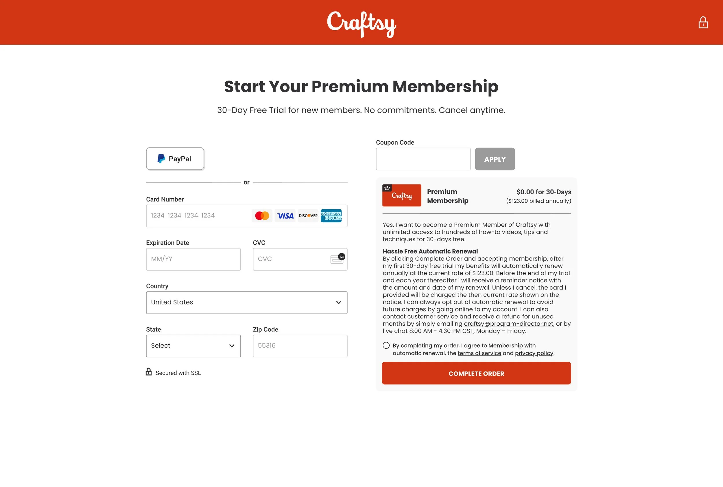
Free Trial - Payment Method

Personalized Onboarding

Gathering Personalized Data

Personalized Discover Page (Member Home Page)
Modernizing the Viewing Experience
Product Vision Enhancements
To elevate the viewing experience, I designed and implemented UI/UX enhancements grounded in both industry best practices and the usability needs of our older demographic. A key focus was introducing a highly visible and intuitive “Continue Watching” feature, complete with progress indicators that make it effortless for members to start, pause, and resume their classes.
From a development perspective, these enhancements were architected to function seamlessly across all platforms—including desktop, mobile-responsive web, native mobile apps, and OTT devices—ensuring a consistent and reliable experience no matter how members access their content.

Step 1: Watch Class
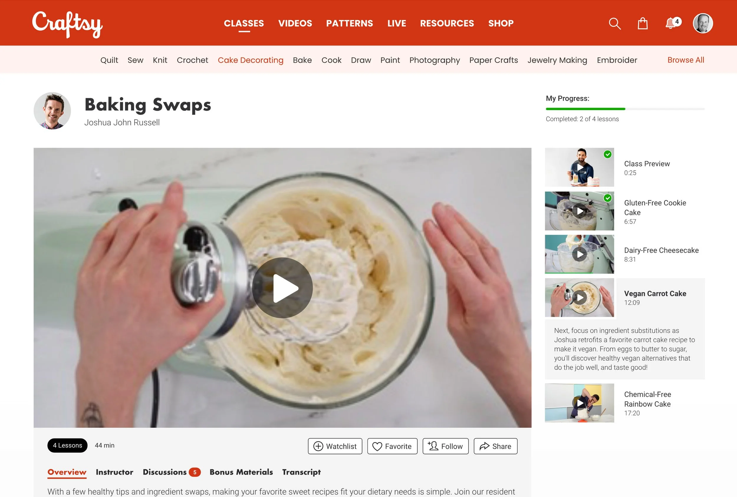
Step 2: Continue Watching Class (Progress Tracking)

Step 3: Class Completion

Step 4: Personalized Email (Congratulations)
A Smarter “My Content” Hub
Organizing the Experience
To further enhance the viewing experience, the “My Content” section that serves as the personalized hub for each member. This area centralizes the member’s activity and preferences, making it simple to pick up where they left off or explore saved content.
Beyond improving navigation and user satisfaction, the data captured within My Content directly informs the platform’s personalization algorithms. This enables smarter content recommendations within the member experience and drives targeted personalization in email campaigns—ultimately boosting content engagement and improving overall retention.
The My Content dashboard includes intuitive carousels for:
Continue Watching — easily resume videos or classes with progress indicators
My Watchlist — saved content for future viewing
My Favorites — quick access to favorite videos, patterns, or articles
Followed Instructors — stay updated with new content from preferred experts
Completed Content — a record of finished classes, reinforcing a sense of progress and achievement

My Content - Dashboard & Continue Watching

My Content - Watchlist (Overflow Menu)

My Content - Favorites
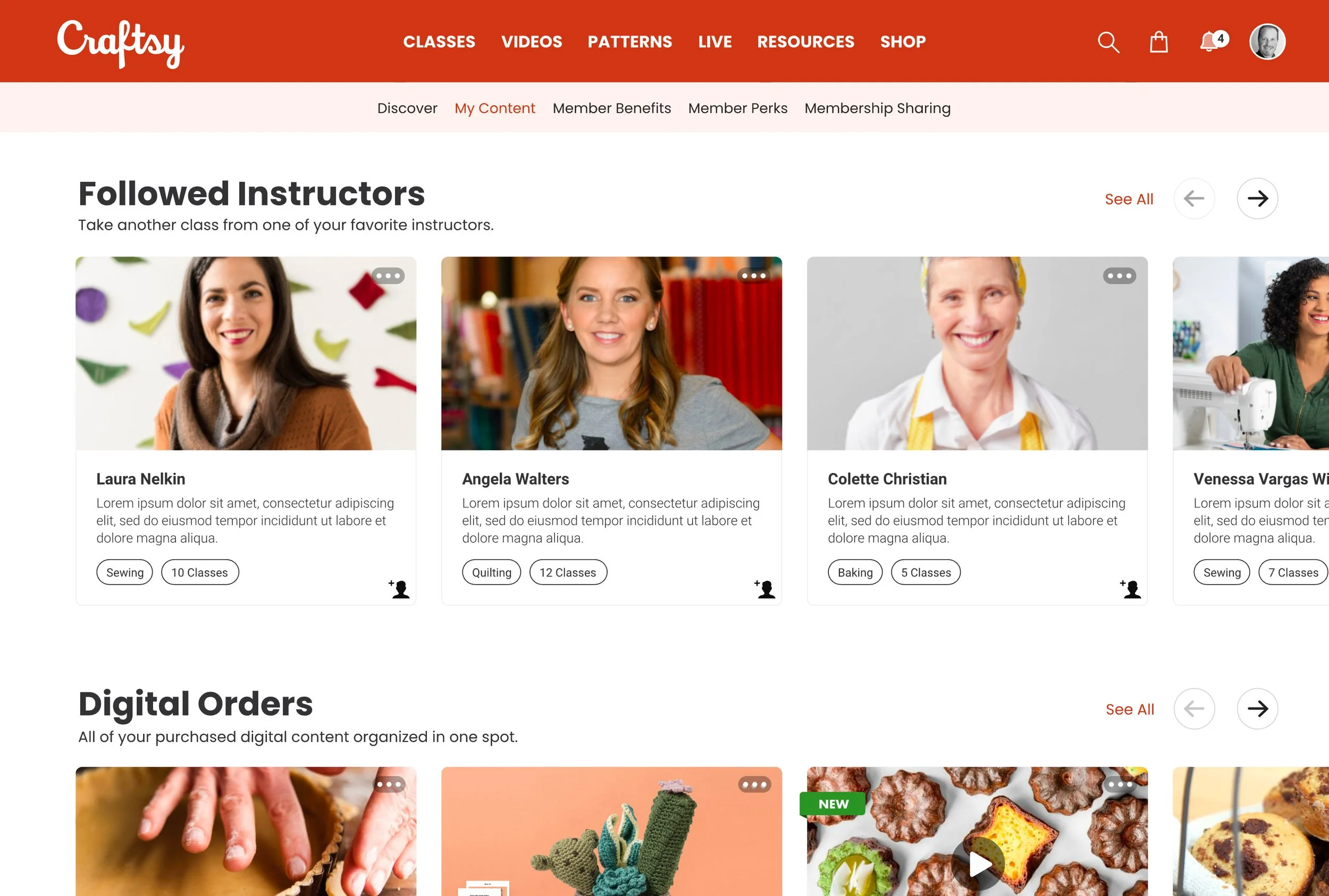
My Content - Followed Instructors

My Content - Completed Content
See it in Action
My Content Dashboard
This walkthrough highlights how the redesigned My Content hub delivers a more intuitive and personalized experience. Before leading this UX transformation, the My Content section lacked organization—it wasn’t grouped into meaningful categories, making it difficult for members to filter, search, or quickly find their saved or recently viewed content.
The improved layout now makes it easy for members to track their progress, quickly access saved content, and stay connected with their favorite instructors. Behind the scenes, every interaction fuels the personalization engine—helping surface more relevant content within the platform and through targeted email recommendations, driving stronger engagement and retention.
See it in Action
AI Teaching Assistant Overview
To demonstrate TN Marketing’s forward-thinking approach to personalized learning, this video showcases the AI Teaching Assistant — a scalable solution built for Craftsy and extended across all 18 brands on the TN Marketing streaming platform.
By leveraging transcript data securely stored behind the firewall, the assistant intelligently interprets course content and user behavior to deliver personalized class recommendations. Members can easily find classes that match their interests and skill level; and if a class isn’t a perfect fit, the assistant dynamically suggests smarter alternatives based on individual viewing history and contextual intent.
This initiative illustrates how TN Marketing transformed static video catalogs into adaptive learning ecosystems, blending human creativity with AI-driven personalization to deepen engagement and retention at scale.